Currently, Sky Bird Travel and its associated companies are going through a gradual re-brand.
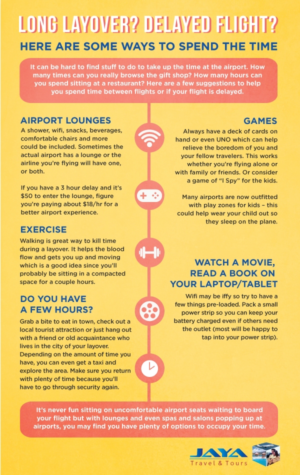
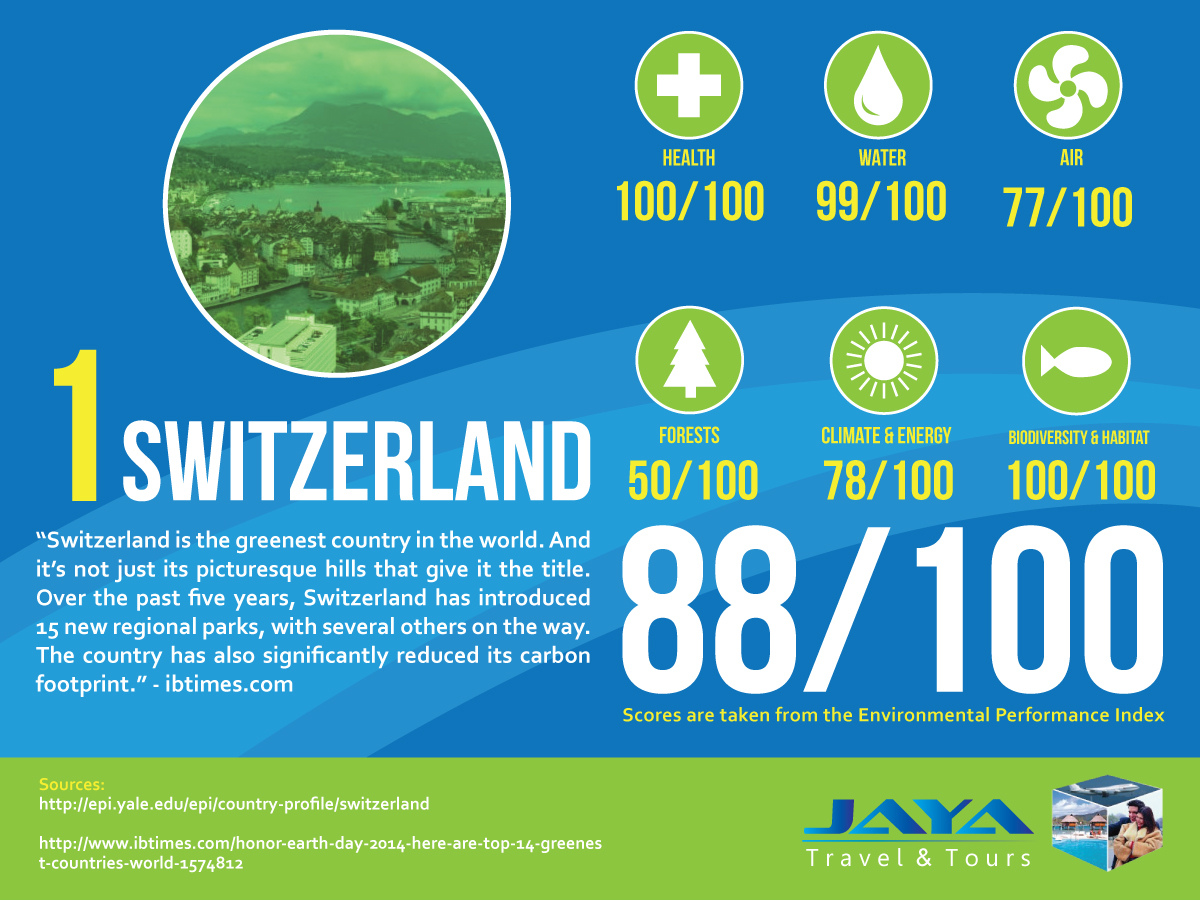
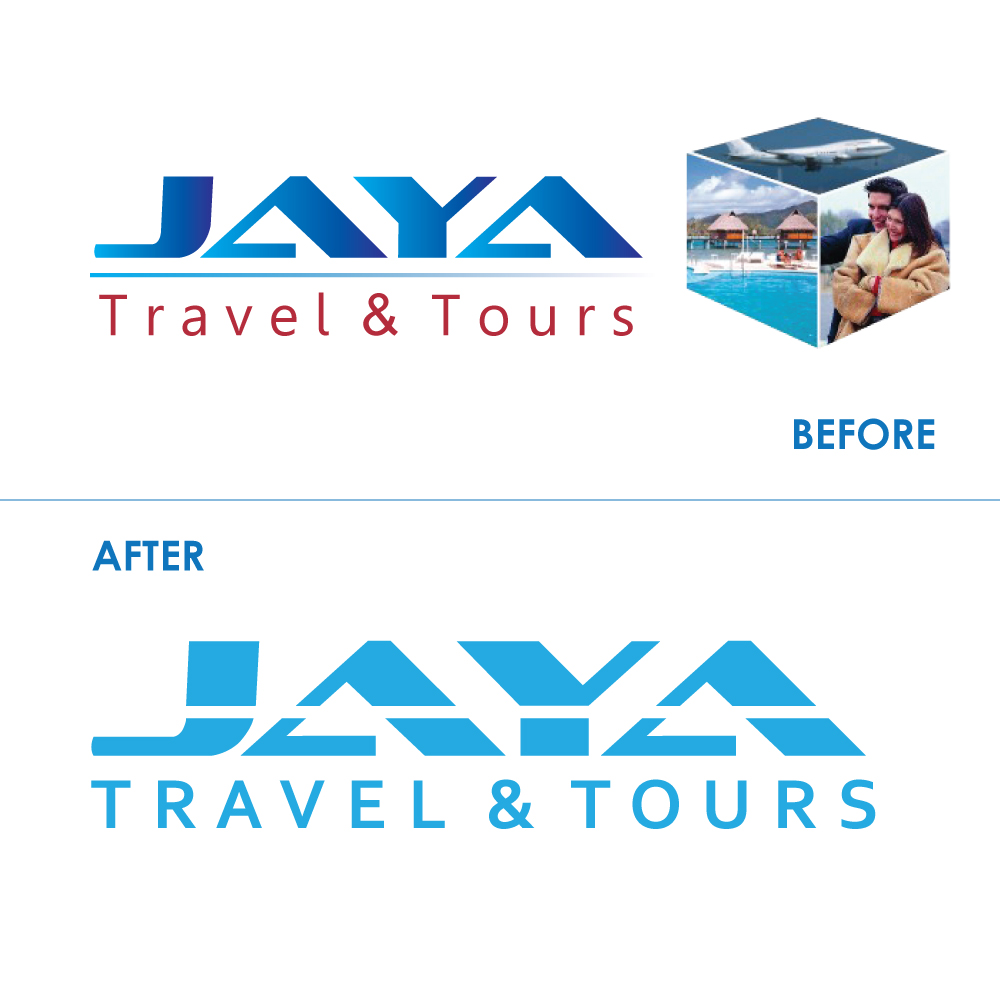
While designing for Jaya, the hardest thing to do is work around the logo, as evidenced by my Earth Day social media infographic. Out of the many logos our company intends to revisit, Jaya Travel needs it the most. Its improper use of gradients, lack of flexibility, and use of jpeg images creates a lot of unnecessary obstacles for marketing to reach it's utmost potential. However, it does contain salvageable elements that have been obscured perhaps due to "too many cooks in the kitchen." The type treatment for "Jaya" is actually very strong in my opinion, so my goal was to build a proper, more flexible and contemporary logo around that.
The first task was to remove the jpeg cube entirely. The next step was to remove the gradient in "Jaya." A flat logo is usually better for a brand identity (although there are some exceptions). After that, I removed the gradient line between the title and subtitle and re-created it as a break through the "Jaya" type treatment. The purpose of this is to give it more flexibility and allow multi-color treatments for holidays, special events, or cultural references.
Finally, I replaced the "Travel & Tours" type with a sharper sans serif, corbel, and made it all caps to be more cohesive with the Jaya name.
To apply the re-design, I used some free stock photos and applied the logo in all white. Also, I experimented with multiple shades, colors, and color-combinations to further emphasize the flexibility.
As of right now, this is still very much a proposal only, and the redesign is still in the hypothetical phase of application; we're still using the current logo, and the final redesign could end up being something completely different. Still, as we wait for the green light to implement some big changes, this will remain a valid portfolio piece.


